Planet-friendly proteins
Planet-friendly proteins
Forging a path to living well
on your own terms

Brand Strategy
Brand Design
Happy Fuel is a personal and professional coaching service with the purpose to empower individuals to find their own path to happiness. They aim to bring back joy and purpose in people’s lives by helping them discover what works for them, and by focusing on the real and vulnerable facets that make every individual unique.
We collaborated with Happy Fuel to create a brand strategy and identity that embodies their approach to coaching within personal growth and discovery based on experimentation.
In order to accurately understand Happy Fuel and successfully position them as an innovative and unconventional brand in this space, we dove deep into their industry landscape by conducting research into their direct and aspirational competitors, the culture of coaching and wellness, and target audience sentiments.
After extensive research, plentiful insights emerged. The wellness and coaching industry was getting a make-over, primarily driven by individuals’ coping mechanisms, such as joy-seeking maximalism, as a reaction to the anxiety-ridden times we live in (rising cost of living, climate crisis, COVID-19, and the list goes on). Wellness is taking on a shift from the culture of perfection to the culture of realism, in which the messy but real has entered into the spotlight.
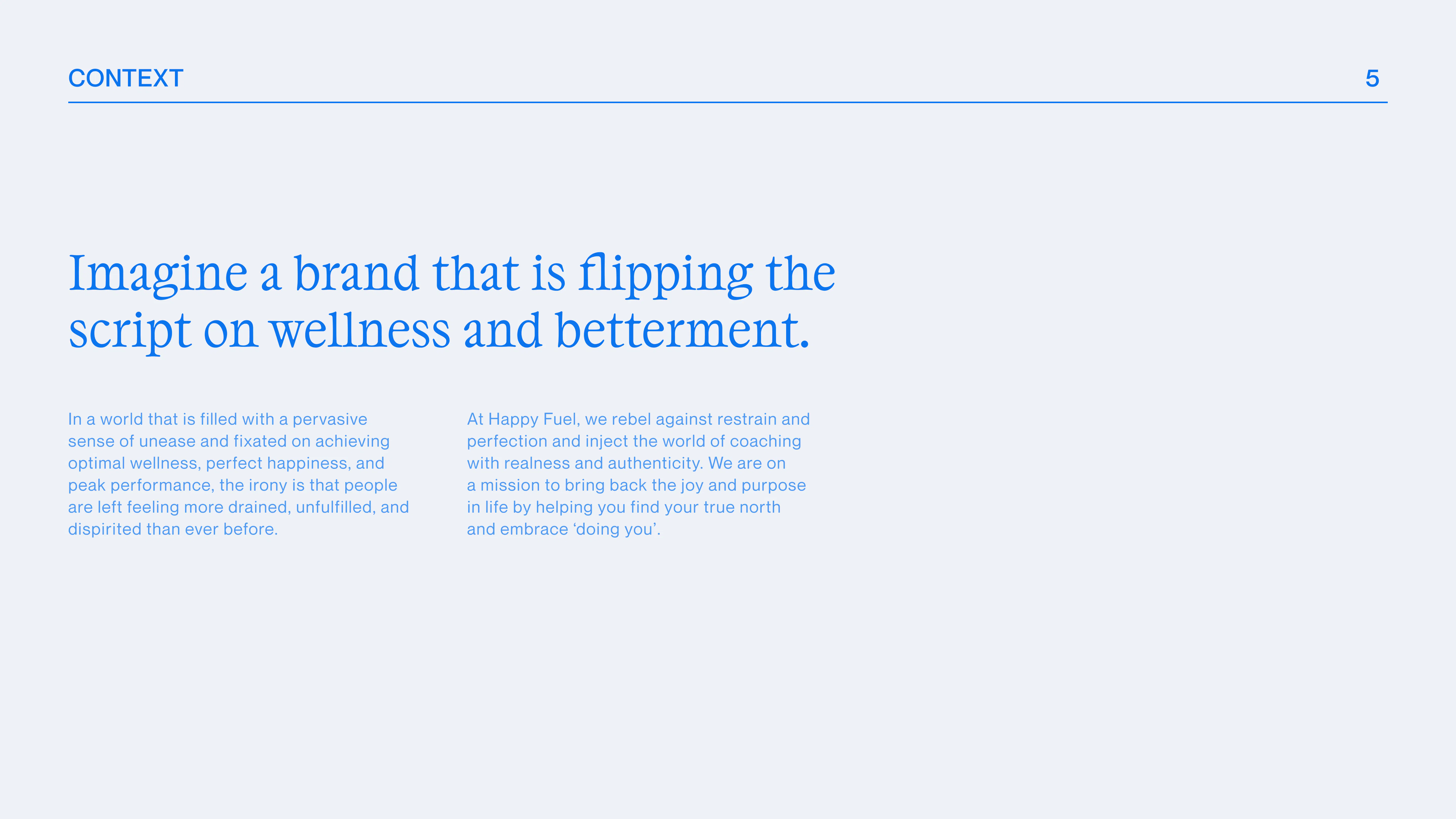

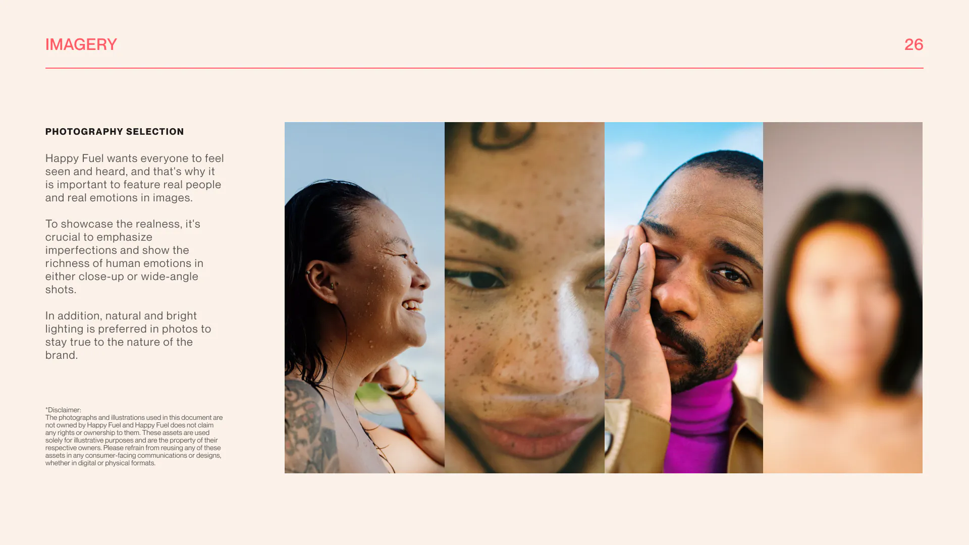
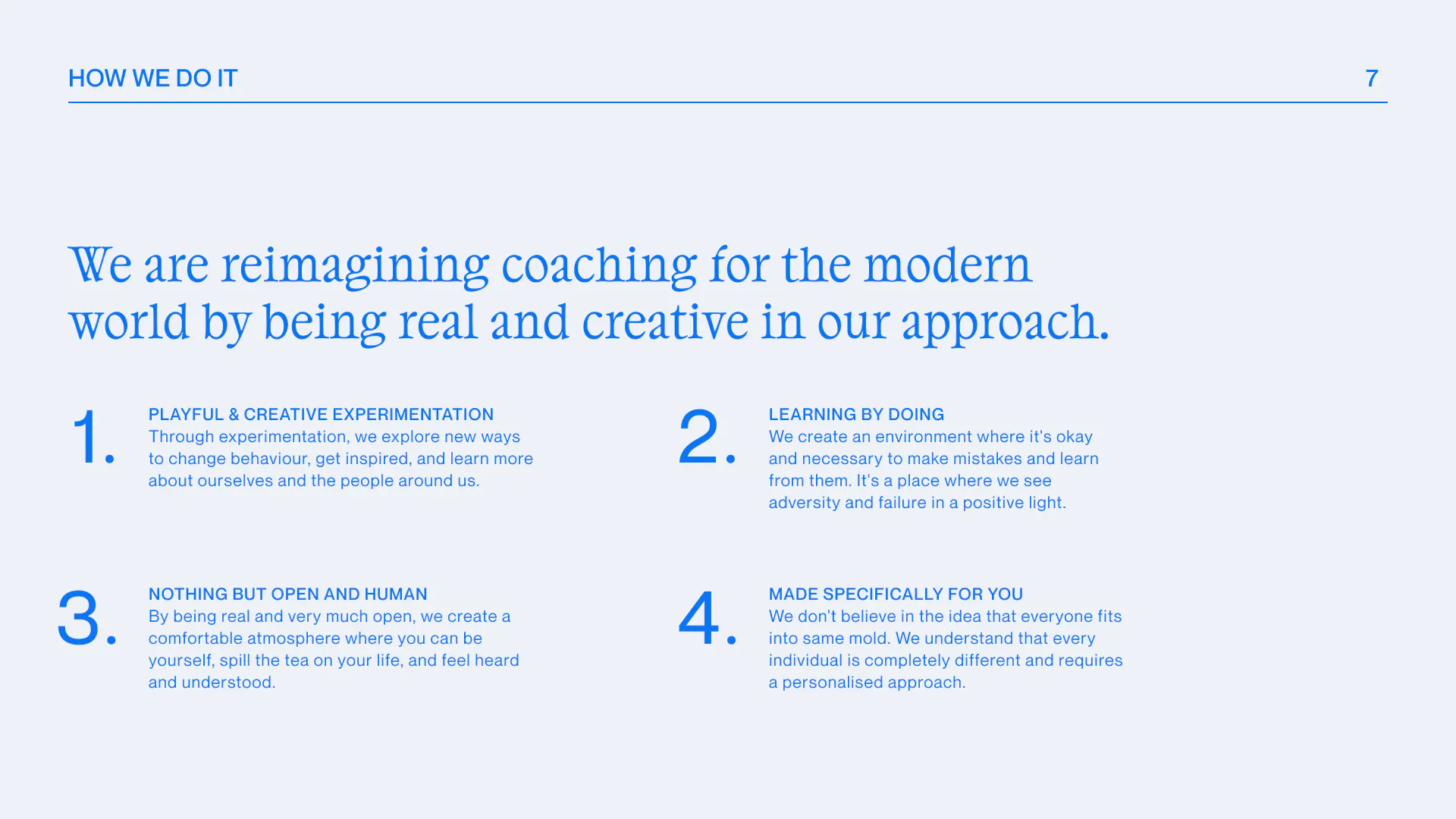



This shift in culture and consumer sentiment was the perfect backdrop for Happy Fuel, which was already honing a personalised, hands-on approach embedded in sharing vulnerabilities, using creativity to self-reflect, and redefining the notion of happiness. Based on this insight, thorough research and creative conceptualisation, the brand story we landed on for Happy Fuel is called ‘A Lab for the Curious’, which is an experimental playground for self-discovery and empowering people to find their own path to happiness.
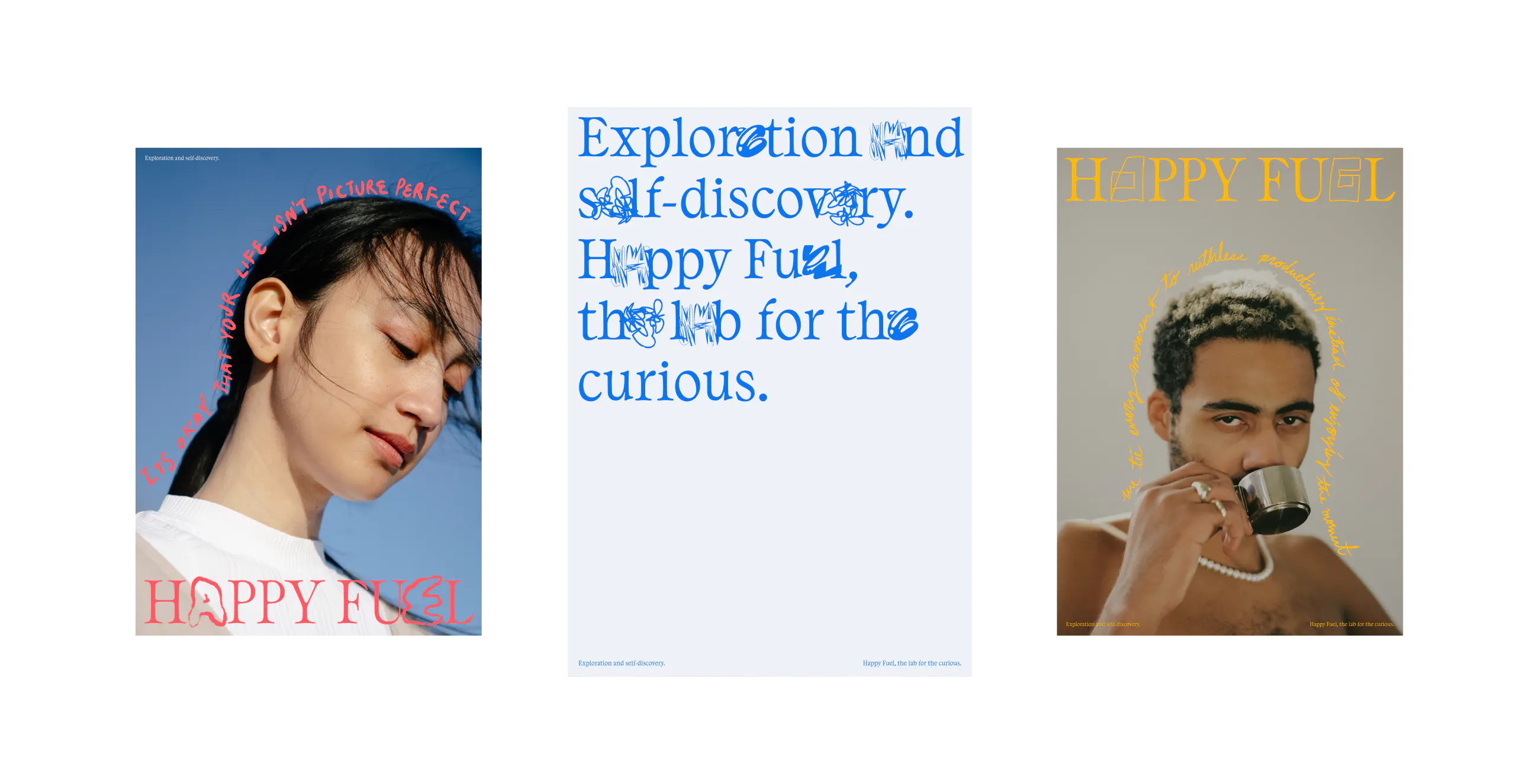
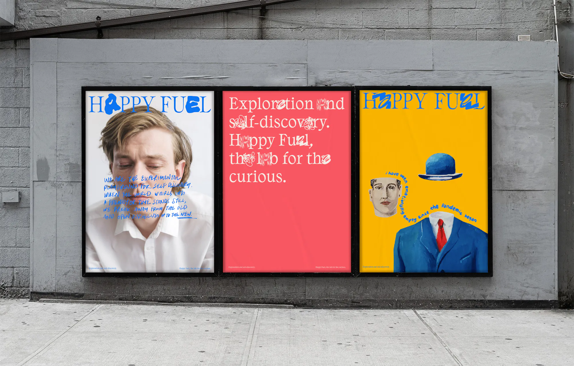
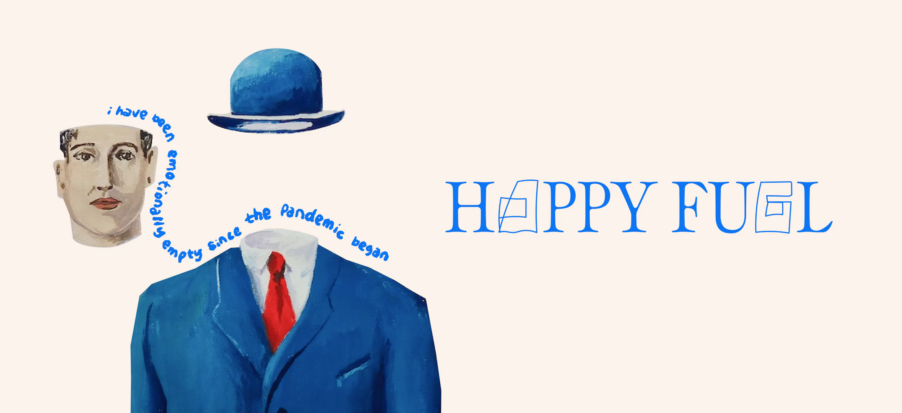
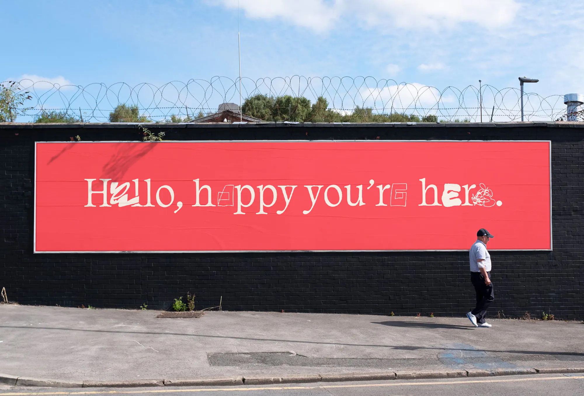
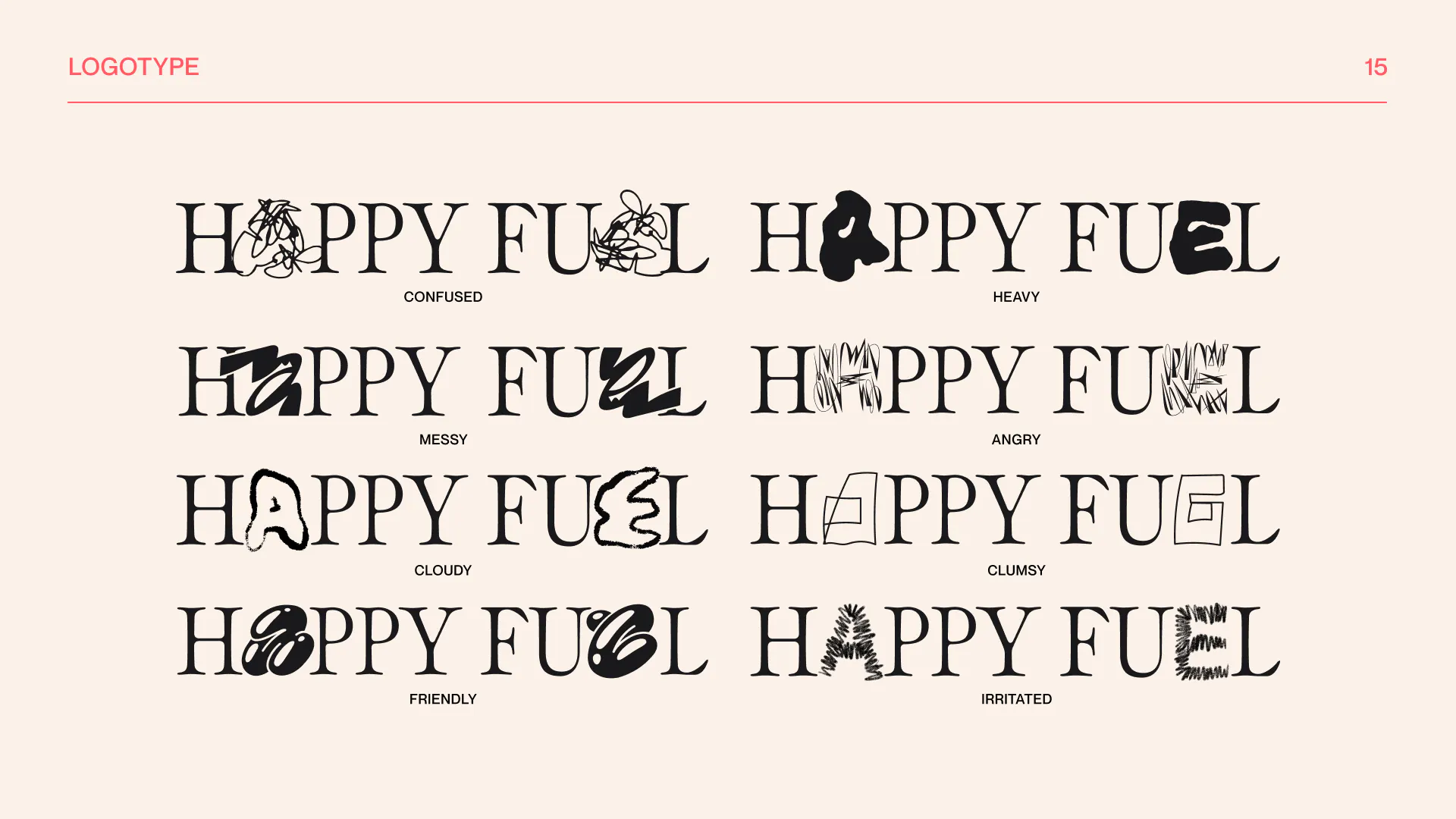
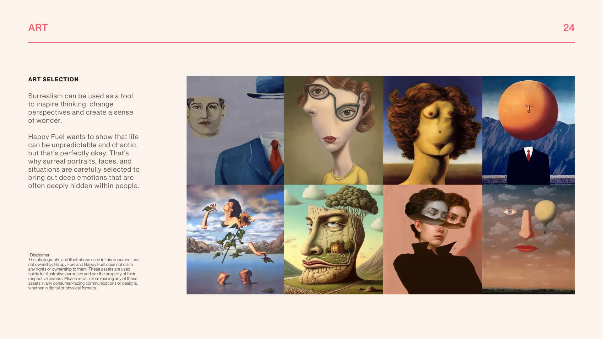
In the translation from strategy to brand identity, every design element was carefully crafted to align with the concept. The logo type was designed on the idea that people are multifaceted and Happy Fuel welcomes the real, raw emotions and vulnerability that people bring to the table. Each letter represents an emotion such as confused, heavy, clumsy, and interchanges at a pace in order to capture the diversity and transformation process. The colour palette was inspired by outcomes people would potentially strive for: energy, clarity, compassion, drive. Last but not least, the pairing of surreal art with handwritten scribbles capturing contemporary sentiments brought in humour, playfulness and self-reflection into the brand.
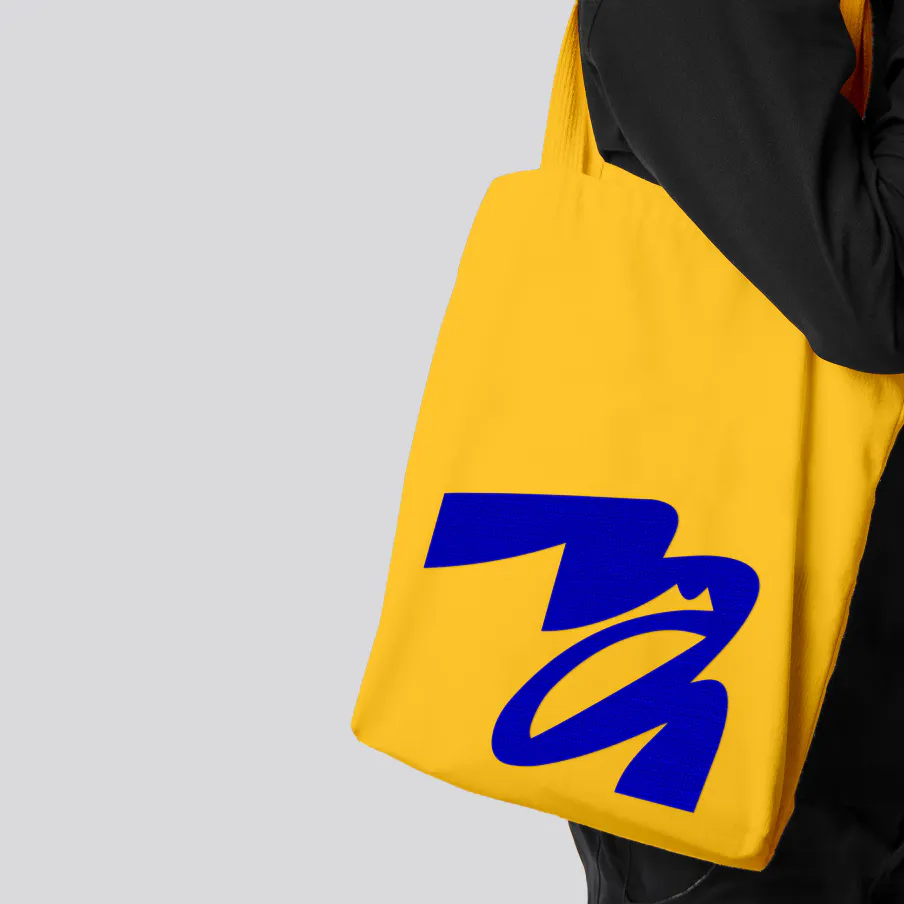
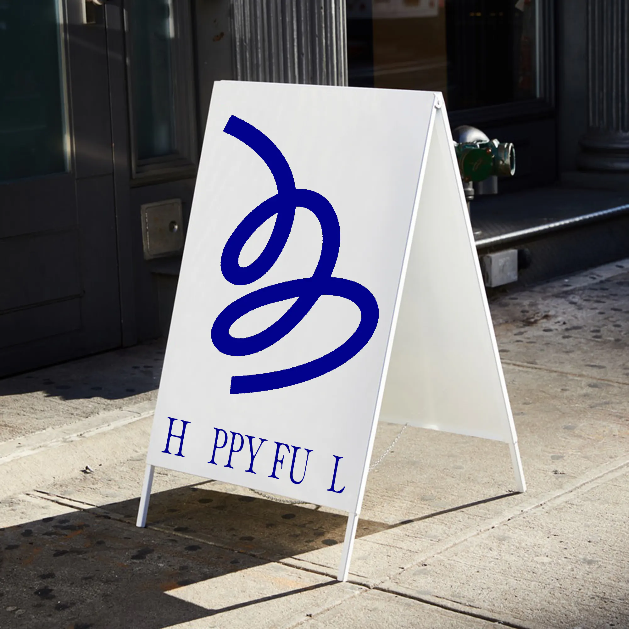
This new brand identity will lead Happy Fuel to pave the way towards working with their dream clients and guiding them towards a fuller, more purposeful life in which they can rewrite happiness on their own terms.
